Mood Boards For Website Design – A Comprehensive Guide
VERIFIED
- Amber
Web Design Manager
VERIFIED
What you'll learn?
Read time
- 7 Minutes
- 7 Minutes
Published
Creating a website is more than just coding and functionality—it’s about expressing the brand identity visually in a way that resonates with the target audience. One of the most effective tools for achieving this is the mood board. At Nation Media Design, we utilize Canva to craft detailed digital mood boards that guide the design process from start to finish. Let’s dive into the importance, process, and tools involved in creating stunning and effective mood boards for website design.
Key Takeaways
- Mood boards are essential tools for aligning your creative team and defining the visual direction for any website design project.
- Using tools like Canva, you can easily gather and organize visual elements, ensuring a cohesive design process from start to finish.
- A well-crafted mood board helps communicate the brand identity, inspire creativity, and gather valuable feedback from clients and team members before moving into development.
What is a Mood Board?

Definition and Purpose
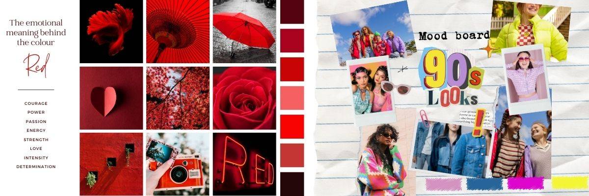
A mood board is a visual representation of a design concept, serving as a powerful tool to communicate ideas and inspiration to clients, stakeholders, and team members. Essentially, it’s a collage of images, colors, textures, and typography that collectively evoke a particular mood or atmosphere. The primary purpose of a mood board is to establish the tone and personality of a design and brand, providing a clear, immersive visual presentation of design ideas.
By laying out these visual elements, a mood board helps to align everyone involved in the project, ensuring that the final design is cohesive and true to the brand’s vision.
The Importance of a Mood Board for Website Design
A mood board is essentially the DNA of a website’s design. Mood boards serve as the foundation that defines the overall visual direction of the site, ensuring the final design aligns with the brand values and vision. By gathering visual inspiration and experimenting with different design elements, a mood board helps designers and clients visualize the end result long before development begins.
At Nation Media Design, we believe that a great mood board ensures consistency in the design process, allowing the entire creative team to stay on the same page throughout the project. Whether it’s color palettes, typography, or images, a well-curated mood board captures the essence of the brand identity and ensures that the final website delivers a cohesive and engaging experience.
How to Create a Moodboard for Website Design

Creating a web design mood board for a website requires careful planning and creativity. Here’s a step-by-step guide to help you create a mood board that will inspire and inform the design process:
1. Define the Brand Identity
Before you begin gathering visual elements, it’s crucial to understand the brand values and personality of the website you’re designing. What does the brand represent? What is its voice? This foundation will guide the selection of every element in your own mood board.
2. Gather Visual Inspiration
Start by collecting various design elements such as images, textures, color palettes, and typography that resonate with the brand’s message. Websites like Pinterest, Dribbble, and Behance are excellent resources for discovering inspiring mood board examples.
3. Use Canva to Organize Your Ideas
At Nation Media Design, we use Canva to create our digital mood boards. Canva allows you to easily drag and drop visual elements, experiment with color schemes, and create polished mood boards that are easy to share with clients and other team members. Whether it’s for a minimalist design or a more colorful, vibrant site, Canva offers flexibility and precision for creating stunning mood boards.
4. Choose the Right Color Palette
The color palette is one of the most essential elements of any mood board. Colors evoke emotions and can influence how users perceive the website. Make sure your mood board includes a balanced color scheme that reflects the tone and feel of the brand.
5. Incorporate Typography and Font Styles
Fonts are just as important as colors when it comes to defining a brand’s identity. Use the mood board to showcase different font styles that fit the design direction and ensure they work well together. At Nation Media Design, we often explore multiple font options on our mood boards to find the perfect combination that aligns with the brand’s tone and style.
6. Add Images and Visuals
Adding images and other visual inspiration is critical to completing your mood board. Most mood boards aim to minimize text by using evocative imagery and colors to convey emotions. These could be photographs, icons, or graphics that reflect the desired tone of the website. It’s important that these visuals are cohesive and align with the overall visual theme.
7. Include Patterns, Textures, and Other Design Elements
Don’t limit your mood board to just images and colors. Incorporating patterns, textures, and design elements like borders, buttons, and layouts can help you further define the visual direction. These subtle elements can elevate the design from good to great.
8. Choose a Mood Board Format
When creating a mood board, selecting the right format is crucial to effectively convey your design vision. You have the option to choose between physical and digital formats, each with its own set of advantages. Physical mood boards can be crafted using materials like paper, fabric, and found objects, offering a tactile experience that can be particularly engaging.
On the other hand, digital mood boards, created using software and digital tools, provide flexibility and ease of sharing, making them ideal for collaborative projects. Consider the specific needs of your project and your personal preferences when deciding on the format. Whether you opt for a physical or digital mood board, the key is to ensure it effectively communicates your design ideas and inspires your team and clients.
Best Practices for Effective Mood Boards

Keep it Simple and Focused
Creating an effective mood board hinges on simplicity and focus. Avoid the temptation to clutter your mood board with too many elements, as this can dilute the clarity of your design ideas. Instead, concentrate on a few key elements that truly capture the desired mood or atmosphere. Use a limited color palette, carefully selected typography, and imagery that aligns with your design vision to create a cohesive and visually appealing mood board.
By keeping your mood board simple and focused, you ensure that it effectively communicates your design ideas, making it easier for your team and clients to understand and be inspired by your vision.
Tools and Software for Creating Mood Boards

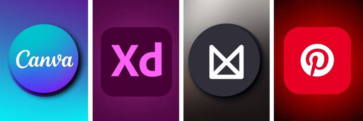
While Nation Media Design prefers Canva for its user-friendly interface, there are many tools available to help you create your website mood board. Here are a few popular options:
Benefits of Using a Mood Board in Website Design
Ensures Consistency
A well-crafted mood board helps maintain consistency throughout the web design process. Whether working with a large team or a single designer, a mood board ensures everyone understands the visual direction and can easily contribute ideas that align with the overall project.
Sparks Creativity
Sometimes, seeing all your visual inspiration in one place can spark new design ideas. At Nation Media Design, we’ve found that gathering everything in one mood board often leads to more innovative design solutions that enhance the final product.
Helps Gather Feedback
A mood board is a great way to communicate your design intentions with clients and get early feedback. This prevents costly design changes later in the project. Sharing a mood board allows clients to see exactly what to expect and offers an opportunity to tweak elements before the actual design project begins.
Inspiring Mood Board Examples

Let’s look at some inspiring mood board examples that demonstrate the versatility of this tool. From websites focused on natural, earthy tones to those with a clean, minimalist look, mood boards can vary greatly depending on the brand identity.
Example 1: Minimalist Web Design

This mood board uses a simple color palette with muted tones, straight lines, and minimal visual elements to create a clean, modern aesthetic. It focuses on simplicity and balance.
Example 2: Vibrant and Bold

Using bold, contrasting colors and vibrant images, this mood board conveys energy and excitement. It’s perfect for a brand that wants to grab attention and exude confidence.
Example 3: Nature-Inspired

Soft greens, natural textures, and earthy tones dominate this mood board, creating a calm and soothing atmosphere. This is great for wellness brands or eco-friendly companies.
Example 4: Tropical Paradise

A tropical mood board is all about bright, bold colors, lush greens, deep blues, and golden yellows. Inspired by tropical landscapes, this mood board features palm leaf patterns, sandy textures, vibrant floral images, and turquoise water elements. The color palette evokes warmth, relaxation, and adventure—perfect for brands in travel, leisure, or beachwear industries looking to convey an inviting, exotic vibe.
By utilizing mood boards for website design, and leveraging tools like Canva, you can streamline the creative process, ensure consistent communication, and create a website that truly reflects the brand identity. Whether you’re looking for a sleek, minimalist design or something bold and colorful, a well-constructed mood board is the key to turning your vision into reality.
Conclusion
Incorporating mood boards into your website design process is an invaluable step in aligning your creative team, defining a clear visual direction, and ensuring consistency throughout the project. By gathering visual inspiration and experimenting with design elements, you can create a cohesive brand identity that resonates with your target audience.
At Nation Media Design, we leverage Canva to craft detailed and engaging mood boards that help our clients visualize the final design before development begins. Whether you’re looking for a mood board for web design, branding, or any other creative project, we can create one tailored to your needs. Let us help bring your vision to life with a mood board that sets the perfect tone for your next project, ensuring your brand shines with clarity and purpose.

